|
|||||||


| View Poll Results: Which Logo do you prefer? | |||
| The first (top one) |
|
21 | 9.25% |
| The second (bottom one) |
|
144 | 63.44% |
| I prefer the old logo |
|
62 | 27.31% |
| Voters: 227. You may not vote on this poll | |||

|
|
|
Thread Tools | Display Modes |
|
|||||||
| View Poll Results: Which Logo do you prefer? | |||
| The first (top one) |
|
21 | 9.25% |
| The second (bottom one) |
|
144 | 63.44% |
| I prefer the old logo |
|
62 | 27.31% |
| Voters: 227. You may not vote on this poll | |||
|
|
|
|
Thread Tools | Display Modes |
|
|
 20-07-2009, 12:23 PM
|
#1 | ||

   Join Date: Sep 2005
Location: Emilia, Italy
Posts: 8,518
|
The second

__________________

|
||


|
|
|
20-07-2009, 01:03 PM
|
#2 | ||
 Join Date: May 2009
Location: Muenster, Germany
Posts: 2
|
2. !
Allthough i`d like to see the whole design, im afraid the site might get pretty "pale" without the black background, Monocolor aint this cool anymore! |
||
|
|
|
|
20-07-2009, 02:17 PM
|
#3 | ||

 Join Date: May 2005
Location: Nitra, Slovakia
Posts: 6,533
|
so this post gets deleted again if i say that i don't like the new design?

__________________

|
||
|
|
|
|
20-07-2009, 05:01 PM
|
#4 | ||

  Join Date: Oct 2004
Location: Wimbledon, England
Posts: 1,624
|
I prefer the second version of the logo.
It's clearer and easier to read, it stands out more. I personally think the 2005 logo is the best the site has had, and still surpasses the current logo, and the new proposed logo. I'm not really sure why I like that logo, I guess it just feels simple and fun. Less contrived and artsy than the efforts since. I think the earlier designs show their age  It can be seen on the AB History page, here's the image: 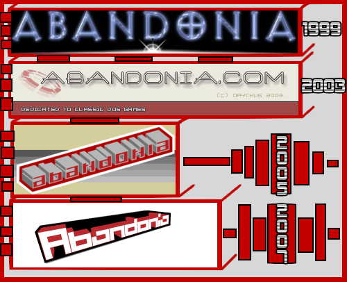 I do think the 'proposed' logo is much nicer than the one we have at the moment. Coupled with a new site, I think it will grow on me. Good work  |
||
|
|
|
|
20-07-2009, 05:05 PM
|
#5 | ||

  Join Date: Mar 2006
Location: Krakeroy, Norway
Posts: 3,014
|
I totally agree on the 2005 logo is the best we've had, but if we're gonna renew it, then I also agree on the 2nd being the best. Not only is it easier on the eye (slightly) but it also is closer to the older ones.
__________________
Je Suis Charlie |
||
|
|
|
|
20-07-2009, 05:36 PM
|
#6 | ||

Join Date: Mar 2005
Location: Roeselare, Belgium
Posts: 1,442
|
I can still tweak the logo of course so any suggestions are welcome.
And yes, the gradient will span the entire header. It's still a work in progress though - I may still make changes.
__________________
 |
||
|
|
|
|
21-07-2009, 12:59 AM
|
#7 | ||

  Join Date: Mar 2006
Location: Stara Pazova, Serbia and Montenegro
Posts: 588
|
I prefer the old(present) logo.

__________________
I'm just G@mer4Life!!! Life is tricky, it doesn't have "Load Game"!  |
||
|
|
|
|
21-07-2009, 02:27 PM
|
#8 | ||

Join Date: Oct 2003
Location: Mullsjö, Sweden
Posts: 1,602
  |
CrybKeeper: Why don't you just add a .com to the end and entry that to the "design-a-tshirt"-contest?
__________________
Meh.... |
||
|
|
|
|
22-07-2009, 12:53 AM
|
#9 | ||
|
Join Date: Apr 2008
Location: Malaga, United States
Posts: 2
|
I personally prefer the old logo... I think it is bolder and captures what I feel the site is about better... DOS & other classic games.
If I had to choose between the two new logos, I would go with the second, but I think it is a pale entry to the current logo. If I were to make a change, it would probably be to keep the angle of the text, include some bolder colors (maybe a whole redirect with grays and blues, or as already suggested, green and black), leave the text font the way it is (it just screams classic programming), and create a shading that reflects either the letters or a classic, universal game. Of course, just my lowly opinion; I think you guys rock at any rate. :thumbs: |
||
|
|
|
|
22-07-2009, 04:23 AM
|
#10 | ||
|
Join Date: Mar 2005
Location: Roeselare, Belgium
Posts: 1,442
|
Quote:
The two current designs are really the same logo but upright with some modification to make it look a bit more dynamic. I'm thinking of slightly editing the second logo - maybe trying to add the shine of the first to the second, make the black shadow less thick, etc. We'll see
__________________
|
||
|
|
|
|
|
 Similar Threads
|
||||
| Thread | Thread Starter | Forum | Replies | Last Post |
| The Abandonia Logo | Maikel | Old News | 32 | 27-11-2007 10:40 AM |
| The new logo | JudgeDeadd | Old Suggestions | 15 | 23-11-2007 05:57 PM |
| Logo Theft? | The Fifth Horseman | Old Suggestions | 19 | 18-02-2007 02:51 PM |
| Graphic Logo | surfwaterford | Blah, blah, blah... | 8 | 05-11-2004 10:04 PM |
|
|
||


 Hybrid Mode
