|
|||||||


|
|
|
Thread Tools | Display Modes |
|
|||||||
|
|
|
|
Thread Tools | Display Modes |
 30-01-2007, 02:01 PM
|
#41 | ||

    Join Date: Oct 2004
Location: Opole, Poland
Posts: 14,276
|
Fixed the moon and the lines:
 How is it now?
__________________
 "God. Can't you people see I'm trying to commit a crime against science and nature here?" -- Reed Richards |
||


|
|
|
03-02-2007, 06:03 AM
|
#42 | ||

Join Date: Feb 2005
Location: Praha, Czech Republic
Posts: 3,273
|
*tips her hat to The Fifth Horseman*
Very nice! The second version is definitely better 
__________________
I have vestigial adventure elements |
||
|
|
|
|
21-02-2007, 02:17 PM
|
#43 | ||
|
Join Date: Oct 2004
Location: Opole, Poland
Posts: 14,276
|
Since I'm making myself pre-configured DosBox shortcuts, I have to make some icons to go with them. Here's some progress on the one for Wibarm, the graphics program used is GIMP v 2.2:
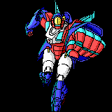 Here's the original picture. Ugly! 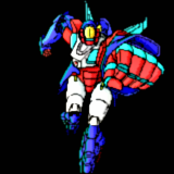 ...Gaussian Blur (x1,5, IIRL) applied. Not as ugly, and the rough "checkerboard" shading turned into shades of the original colors. Blurry, though - next thing I did was to use the Strengthen filter to fix that a bit. What followed was a series of experiments with a modified verion of the beveled text technique. Let's pull a curtain on these sorry mishaps and fast-forward to the results.  This I almost decided to be the final version... but last minute change of plans is my speciality. I'll probably go back to the previous image and re-do the bump-mapping (fortunately for me, I've got it saved as separate layers). 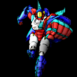 Experiment with using reverse bump mapping to add a more three-dimensional appearance to the picture. The idea's quite sound, but execution leaves a lot to be desired ATM. Will have to work on it some more. Final version coming around tomorrow.
__________________
"God. Can't you people see I'm trying to commit a crime against science and nature here?" -- Reed Richards |
||
|
|
|
|
21-02-2007, 04:42 PM
|
#44 | ||

 Join Date: May 2005
Location: Nitra, Slovakia
Posts: 6,533
|
looks good of course=)
well maybe im a noob but the only difference i have noticed between 3rd and 4th pic is shade tiny blue box on his left chest
__________________

|
||
|
|
|
|
22-02-2007, 12:02 PM
|
#45 | ||
|
Join Date: Oct 2004
Location: Opole, Poland
Posts: 14,276
|
Quote:
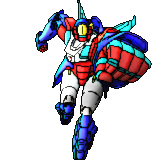 That's final version A. 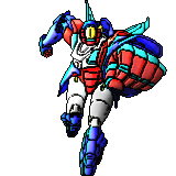 Final version B - the outline was made stronger, and the entire picture was subjected to a reverse bumpmap based on the outline. I'm still thinking whether to up the gamma on them or not. The difference between the first and the final images:
__________________
"God. Can't you people see I'm trying to commit a crime against science and nature here?" -- Reed Richards |
||
|
|
|
|
22-02-2007, 05:49 PM
|
#46 | ||

Join Date: Sep 2005
Location: Emilia, Italy
Posts: 8,518
|
Hey Horseman! I'm a great fan of fantasy style...your miniatures are really cool, my favourite one is Raziel!
Let me tell you a question, I've noticed that Hellsing images are very similar to Trigun... is this the same anime author? Cause IMO Trigun is fantastic and maybe Hellsing too, but I've never seen or read it...what's your opinion? Is it good? ")
__________________

|
||
|
|
|
|
22-02-2007, 06:44 PM
|
#47 | ||

  Join Date: Apr 2005
Location: Turin, Italy
Posts: 1,043
|
Very nice your last pics!
I have a suggestion for you: using the "selective gaussian blur" (I've traslated from italian, hoping it's called in the same way) applied directly on your original one (2 pixel, 130 radius) i've obtained this: 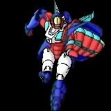 I hope that could be useful to you...
__________________

|
||
|
|
|
|
23-02-2007, 10:25 AM
|
#48 | ||
|
Join Date: Oct 2004
Location: Opole, Poland
Posts: 14,276
|
Quote:
The first Hellsing anime is unfortunately quite mediocre, both in terms of art and storyline (back then only first two volumes were out, so the producers "made up" a different ending to the story). Current anime - also known as "Hellsing Ultimate" (that's the one the sigbars were taken from) - is lethally awesome. (a trailer, if you want to see for yourself) Quote:
__________________
"God. Can't you people see I'm trying to commit a crime against science and nature here?" -- Reed Richards |
||
|
|
|
|
23-02-2007, 05:48 PM
|
#49 | ||
|
Join Date: Sep 2005
Location: Emilia, Italy
Posts: 8,518
|
<div class='quotetop'>QUOTE(the_fifth_horseman @ Feb 23 2007, 12:25 PM) [snapback]280630[/snapback]</div>
Quote:
So strange..one of those guys is equal to Vash the Stampede!  Thanks for the information, I'm gonna watch the link now
__________________
|
||
|
|
|
|
05-03-2007, 09:12 AM
|
#50 | ||
|
Join Date: Oct 2004
Location: Opole, Poland
Posts: 14,276
|
When reading "Bubblegum Zone", I found myself wondering how exactly Sylvie looks in her Hardsuit (first appearance about halfway through episode 9). Based on the rough description in the story, I spent several hours pieceing together a design from parts of the existing official concept drawings and redrawing it where needed. Here's the result:
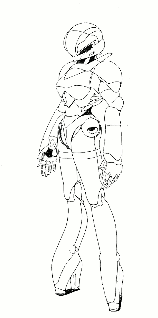 Looks good enough... ...or maybe not. 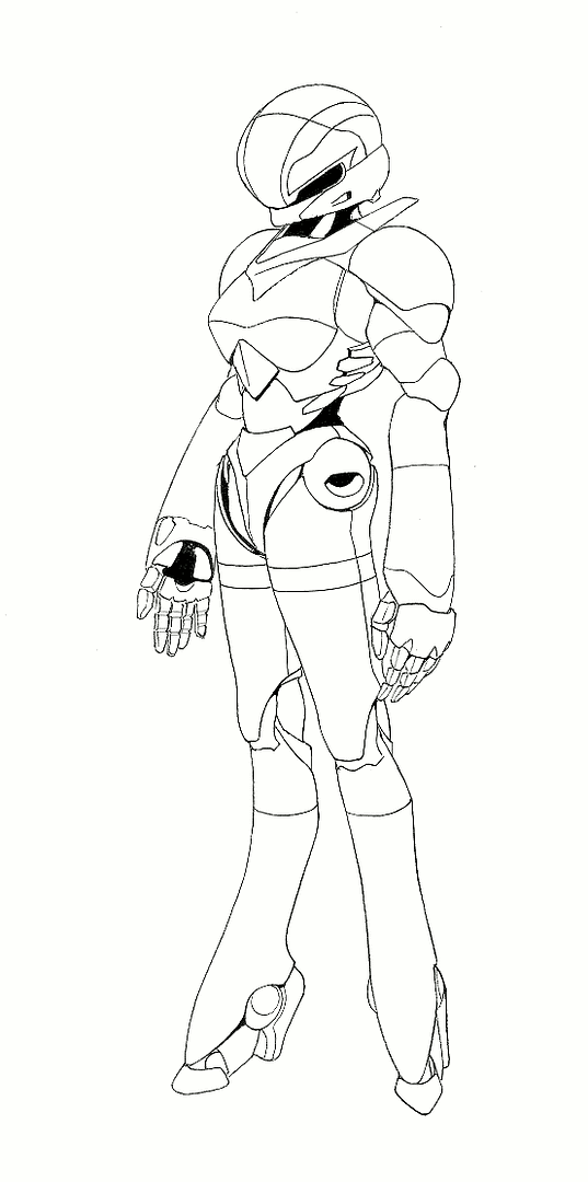 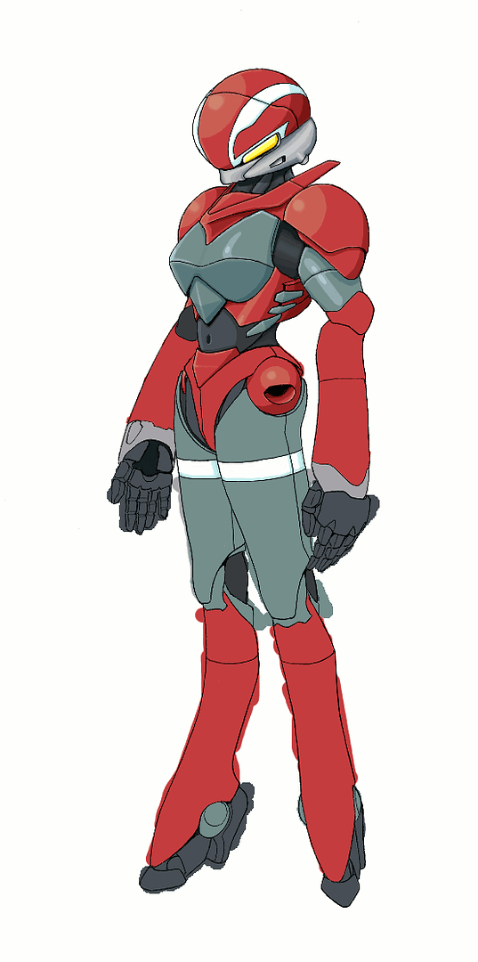 This one is more like it, and I'm already on my way to color it. Some minor touch-ups to the outline as I go. Upper torso nearly done. Not really satisfied with the highlights on the left side of the breastplate and left upper arm. Will see if I can improve them a bit. Feel free to compare with the official Hardsuit designs for Sylia, Priss, Linna and Nene: 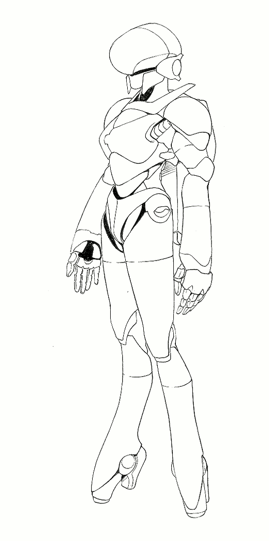 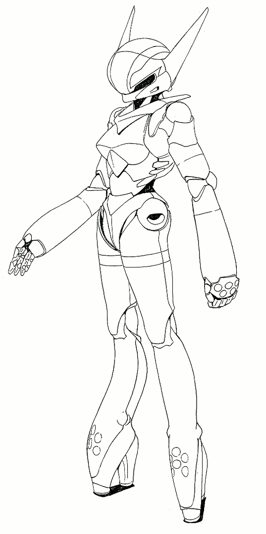  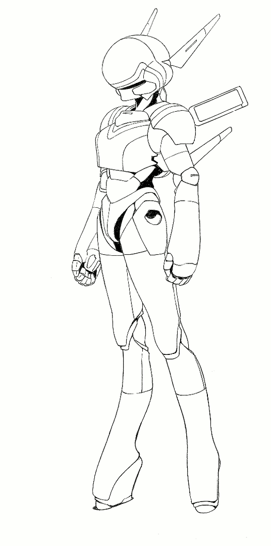 I'm still learning how to do certain things in GIMP - just yesterday morning I couldn't do a metallic surface no matter how hard I tried. Now, obviously, I can. And whowever invented using layers in image files deserves a Nobel Prize for Wold Peace.  It saved me more grief than I care to imagine. It saved me more grief than I care to imagine.
__________________
"God. Can't you people see I'm trying to commit a crime against science and nature here?" -- Reed Richards |
||
|
|
|
|
|
 Similar Threads
|
||||
| Thread | Thread Starter | Forum | Replies | Last Post |
| Links Considered Gif Images (1x1 Pixels) | Abi79 | Tech Corner | 11 | 05-03-2007 10:24 AM |
| Happy Birthday Fifth Horseman | Icewolf | Blah, blah, blah... | 27 | 20-06-2006 02:03 AM |
| A Bunch Of Horseman's Miniatures... | The Fifth Horseman | Music, Art, Movies | 22 | 21-06-2005 04:03 PM |
|
|
||

 Linear Mode

