|
|||||||


| View Poll Results: Which Logo do you prefer? | |||
| The first (top one) |
|
21 | 9.25% |
| The second (bottom one) |
|
144 | 63.44% |
| I prefer the old logo |
|
62 | 27.31% |
| Voters: 227. You may not vote on this poll | |||
|
|
Thread Tools | Display Modes |
|
|||||||
| View Poll Results: Which Logo do you prefer? | |||
| The first (top one) |
|
21 | 9.25% |
| The second (bottom one) |
|
144 | 63.44% |
| I prefer the old logo |
|
62 | 27.31% |
| Voters: 227. You may not vote on this poll | |||
|
|
Thread Tools | Display Modes |
 20-07-2009, 05:01 PM
|
#11 | ||

    Join Date: Oct 2004
Location: Wimbledon, England
Posts: 1,624
|
I prefer the second version of the logo.
It's clearer and easier to read, it stands out more. I personally think the 2005 logo is the best the site has had, and still surpasses the current logo, and the new proposed logo. I'm not really sure why I like that logo, I guess it just feels simple and fun. Less contrived and artsy than the efforts since. I think the earlier designs show their age  It can be seen on the AB History page, here's the image: 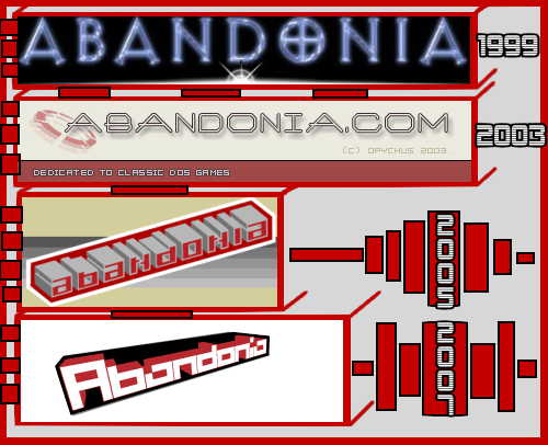 I do think the 'proposed' logo is much nicer than the one we have at the moment. Coupled with a new site, I think it will grow on me. Good work   |
||


|
|
|
|
 Similar Threads
|
||||
| Thread | Thread Starter | Forum | Replies | Last Post |
| The Abandonia Logo | Maikel | Old News | 32 | 27-11-2007 10:40 AM |
| The new logo | JudgeDeadd | Old Suggestions | 15 | 23-11-2007 05:57 PM |
| Logo Theft? | The Fifth Horseman | Old Suggestions | 19 | 18-02-2007 02:51 PM |
| Graphic Logo | surfwaterford | Blah, blah, blah... | 8 | 05-11-2004 10:04 PM |
|
|
||


 Threaded Mode